What Color Cabinets Go With Sherwin Williams Upward Walls?

Sherwin Williams Upward (SW 6239) brings an easygoing vibe that instantly brightens any room. As the 2024 Color of the Year, this shade of blue has quickly become a favorite among homeowners and designers. It feels light and refreshing, like a clear sky after rain, and it adds a sense of peace to any space.

When I first came across Upward, I noticed how beautifully it balances between blue and gray. It is not too bold or too pale, and that is what makes it so versatile. But here is the thing, the magic of this color truly shows when it is paired with the right cabinet color. The wrong pairing can make the walls look flat or dull, while the right one can turn your kitchen or bathroom into a space that feels open, welcoming, and stylish.

Cabinets take up a large part of any room’s visual space, so their color has a huge impact on how Upward appears. Cool-toned cabinets can make the walls look crisp and airy, while warm woods can add balance and depth. In this post, I will walk you through cabinet color ideas that bring out the best in Sherwin Williams Upward. You will find simple guidance, design inspiration, and real-world tips that help you choose a combination that fits your home and personality.

Cabinet Color Ideas That Work Beautifully with Upward Walls

Choosing the right cabinet color is where your design really comes to life. Sherwin Williams Upward has a calm, balanced character that gives you freedom to mix and match with many cabinet tones. Each color family creates a different atmosphere, so the right choice depends on the style and feeling you want your space to have. Let me walk you through some cabinet colors that pair beautifully with Upward walls.

1. White Cabinets

White cabinets are the easiest way to create a clean and open look with Upward. The cool blue-gray tone of Upward makes white cabinets look even fresher and more polished.

Undertone match: Stick with whites that have a cool or neutral base. Warm creamy whites can look yellow against Upward’s coolness

Best paint options:

  • Sherwin Williams Pure White (SW 7005)
  • Sherwin Williams Snowbound (SW 7004)
  • Sherwin Williams Extra White (SW 7006)


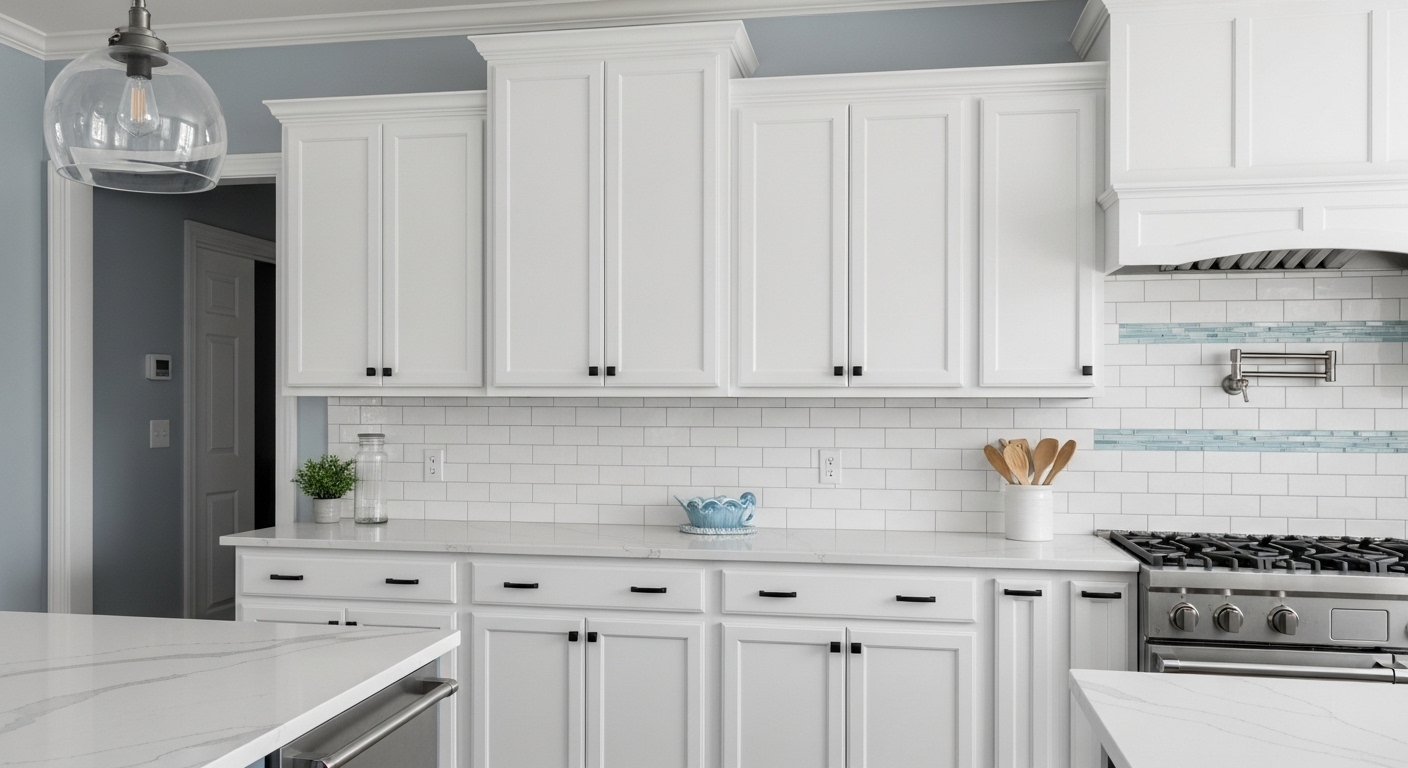
Perfect for: Coastal, Scandinavian, or farmhouse styles.
Hardware picks: Matte black or brushed nickel pulls look crisp against the white.
Countertops and backsplash: Try white quartz with subtle gray veining or a marble-look surface. For backsplash, go for classic white subway tile or light blue glass tiles for a coastal feel.
Mistake to avoid: Choosing warm whites or off-whites that can clash with the cool undertone of Upward.

2. Gray Cabinets

Gray cabinets blend smoothly with Upward walls, creating a layered and sophisticated look. Both belong to the cool color family, so they naturally complement each other.

Undertone match: Choose grays with blue or neutral undertones instead of warm taupe or greige tones.

Best paint options:

  • Sherwin Williams Repose Gray (SW 7015)
  • Sherwin Williams Light French Gray (SW 0055)
  • Sherwin Williams Dorian Gray (SW 7017)


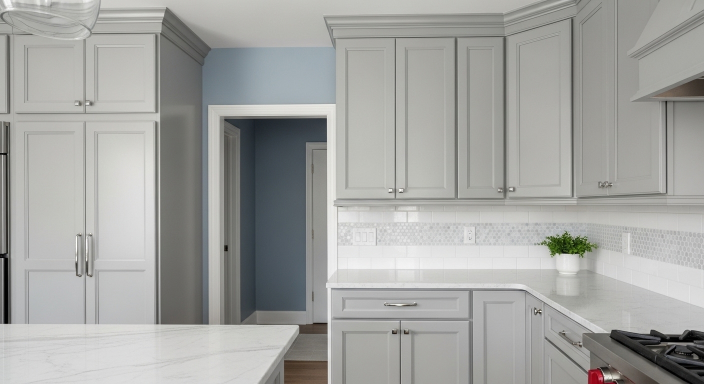
Perfect for: Modern, transitional, or minimalist kitchens.
Hardware picks: Chrome or stainless steel handles match the sleek tone.
Countertops and backsplash: White marble, gray quartz, or pale granite create a calm flow. Add a glossy white or mosaic backsplash for a soft contrast.
Mistake to avoid: Picking a gray that leans too warm, which can make the blue walls look dull or muddy.

3. Navy or Deep Blue Cabinets

If you like a strong and classic look, navy cabinets with Upward walls feel rich and layered. The two blues work together without blending into one another.

Undertone match: Choose a navy that leans cool or neutral to keep harmony with Upward’s gray-blue base.

Best paint options:

  • Sherwin Williams Naval (SW 6244)
  • Sherwin Williams Indigo Batik (SW 7602)
  • Sherwin Williams Gale Force (SW 7605)

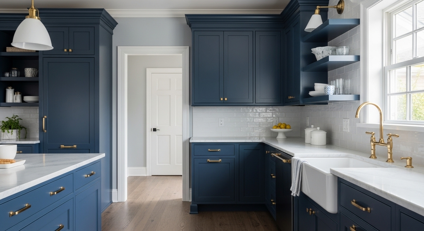
Perfect for: Coastal, traditional, or contemporary designs.
Hardware picks: Brass or gold fixtures add warmth and a touch of luxury.
Countertops and backsplash: White marble, light quartz, or a soft beige countertop works beautifully. A white or gray tile backsplash adds balance.
Mistake to avoid: Using too much dark blue in small rooms with little light. Keep contrast by using lighter counters or open shelving.

4. Natural Wood Cabinets

Natural wood brings warmth to Upward’s cool tone and adds a cozy, inviting feeling. The mix of natural texture and cool color gives your space balance and personality.

Undertone match: Look for wood finishes that have neutral or light brown undertones instead of orange or red hues.

Best finishes:

  • Light oak
  • Whitewashed maple
  • Medium walnut


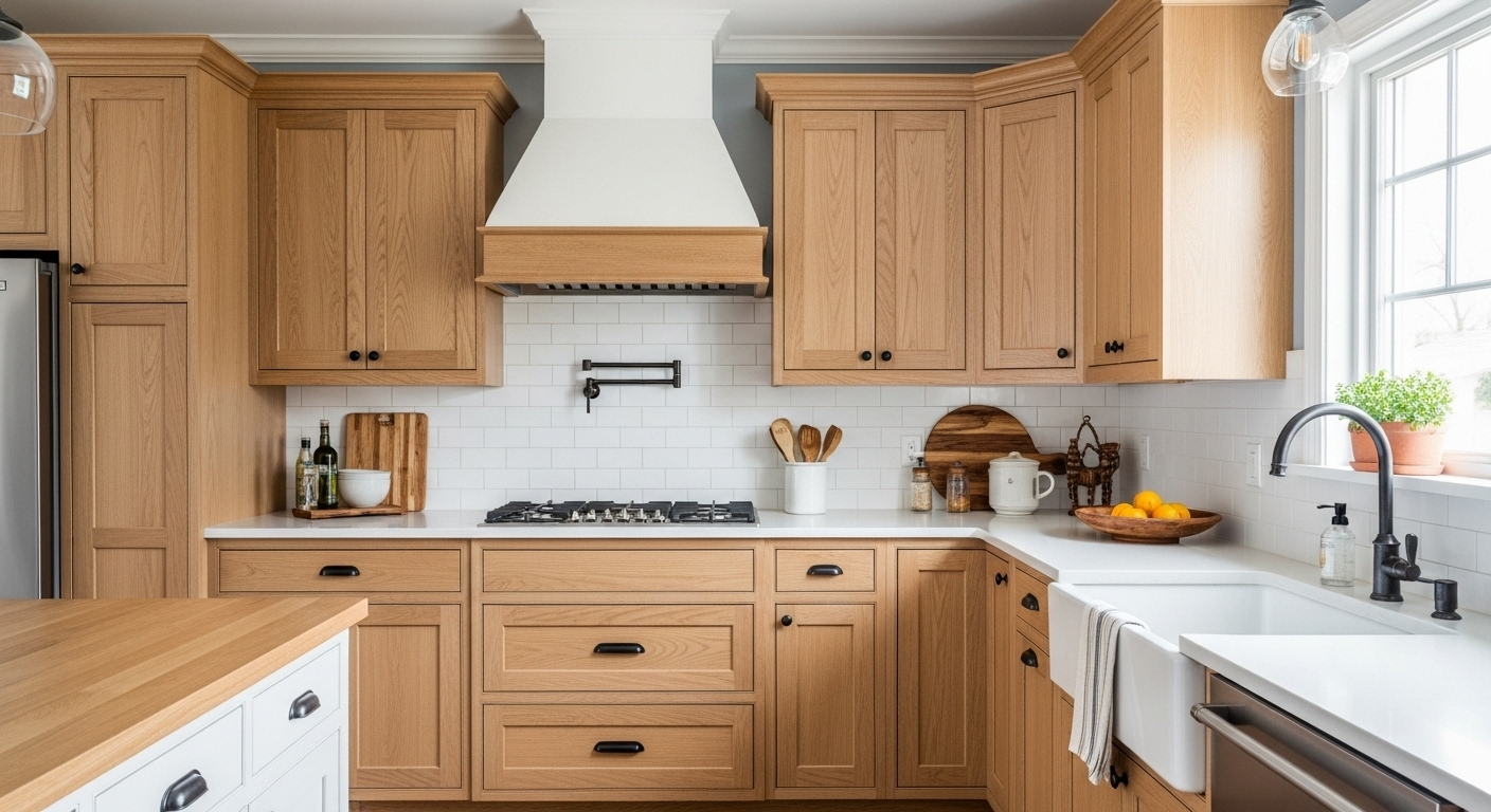
Perfect for: Farmhouse, Scandinavian, or rustic interiors.
Hardware picks: Matte black, oil-rubbed bronze, or aged brass.
Countertops and backsplash: Creamy quartz or butcher block counters pair beautifully. Add a white or off-white tile backsplash for contrast.
Mistake to avoid: Using reddish wood tones like cherry or mahogany that can clash with Upward’s coolness.

5. Charcoal or Black Cabinets

Charcoal or black cabinets against Upward walls create a bold and modern statement. This pairing looks especially stunning in large kitchens or open layouts with good lighting.

Undertone match: Stick with neutral or slightly cool black tones to match Upward’s mood.

Best paint options:

  • Sherwin Williams Iron Ore (SW 7069)
  • Sherwin Williams Tricorn Black (SW 6258)
  • Perfect for: Modern, industrial, or luxury interiors.


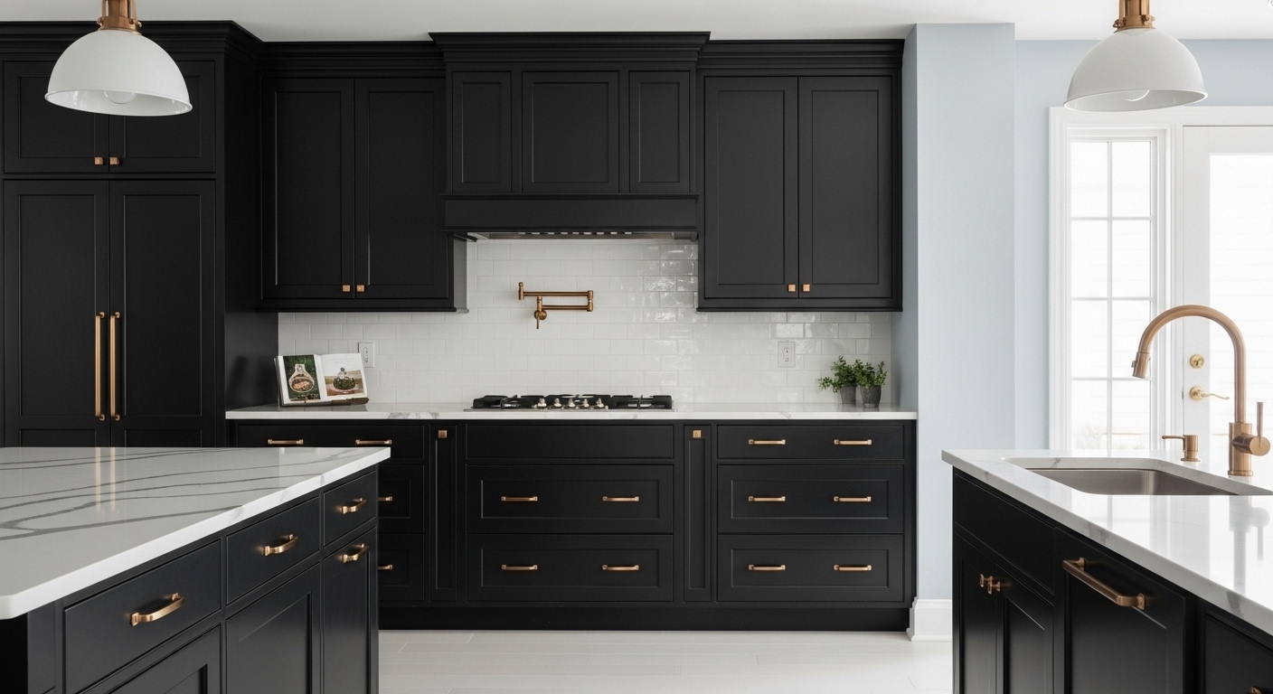
Hardware picks: Brass, copper, or brushed gold adds warmth and elegance.
Countertops and backsplash: White quartz, marble, or gray stone creates a sleek contrast. Go for a glossy white backsplash to bounce light around the space.
Mistake to avoid: Using dark cabinets in small, low-light areas, as they can make the space feel heavy.

6. Two-Tone Cabinet Ideas

Two-tone cabinets are a fun way to mix contrast and balance. Upward walls act as the perfect backdrop for this modern design trend.

Color combinations:

  • White uppers with navy or charcoal lowers.
  • Natural wood base cabinets with gray or white uppers.
  • Light gray perimeter cabinets with a deep blue island.


Perfect for: Transitional, coastal, or contemporary spaces.
Hardware picks: Keep the hardware consistent between tones to maintain flow.
Countertops and backsplash: Choose a countertop that ties both cabinet tones together. A simple white quartz or gray stone surface works best. Add a neutral backsplash for a smooth transition.
Mistake to avoid: Using two cabinet colors with opposite undertones. They should share a similar cool or neutral base to stay in harmony with Upward.

Each of these cabinet colors changes how Sherwin Williams Upward feels in your space. White keeps it fresh, gray adds calmness, navy brings drama, wood adds warmth, and black gives a sharp edge. Once you find your favorite match, you can fine-tune the look with the right lighting, hardware, and countertops to complete the design.

How Light Changes the Look of Upward

Light plays a big role in how Upward appears throughout the day. Here is what I have noticed in different lighting conditions:

  • North-facing rooms: Natural light from the north is cooler, so Upward takes on a stronger gray tone. The walls may look softer and more muted, creating a calm and serene mood.
  • South-facing rooms: Sunlight from the south brings warmth into the space. In this light, Upward looks brighter and more cheerful, showing more of its true blue character.
  • Artificial light: LED bulbs with cool light can make the blue appear sharper, while warm light bulbs add a hint of softness and warmth to balance the coolness.


Because of these lighting shifts, Upward never looks exactly the same at every hour. That little change throughout the day gives it a sense of movement and life, which keeps the room interesting.

The Mood Behind the Color

Upward gives off a calm and airy energy that makes spaces feel open and peaceful. Many people describe it as a “breath of fresh air” kind of color. It is ideal for rooms where you want a relaxing atmosphere, such as:

  • Kitchens, to create a light and clean backdrop for cooking and gathering.
  • Bathrooms, to bring a spa-like calmness.
  • Laundry rooms, to make daily chores feel less dull.
  • Coastal-style homes, where it echoes the sky and ocean without being too bold.


The color feels uplifting and refreshing. It works well in both large open spaces and small cozy corners because it does not overwhelm the eye.

How Upward Interacts with Other Finishes

Upward pairs nicely with a wide range of materials and finishes. Its soft undertone allows it to adapt without clashing.

  • Flooring: Light wood floors highlight Upward’s cool side, while darker or medium wood tones warm it up.
  • Countertops: White, marble, or quartz surfaces make the walls appear crisp and bright. For a warmer feel, try beige or light tan counters.
  • Trim and ceiling colors: Bright white trim, like Sherwin Williams Pure White, helps Upward look cleaner and sharper. If you want a gentler look, an off-white or soft gray trim adds quiet contrast.

Design Styles That Bring Out the Best in Upward Walls

Every home has its own personality, and color plays a big part in shaping that. Sherwin Williams Upward works beautifully across different design styles because of its calm and flexible tone. I have tried it in many settings, and it always adapts in a charming way. Let’s look at how you can pair cabinet colors with Upward walls based on your preferred design style.

Modern Kitchen – Sleek, Simple, and Balanced

In a modern kitchen, clean lines and balance matter the most. Charcoal, gray, or matte navy cabinets pair wonderfully with Upward walls. The cool tones match the airy mood while giving the space structure and depth.

  • Best cabinet colors: Charcoal Gray, Tricorn Black (SW 6258), or Naval (SW 6244).
    Hardware choices: Slim stainless steel or matte black handles.
  • Countertops: White quartz or marble-look surfaces for contrast.
  • Backsplash ideas: Glossy white tiles or thin glass sheets for a polished look.

Modern kitchens with this combination feel stylish but still calm. The key is keeping everything simple and letting the color do the talking.

Coastal or Beach Style – Light, Airy, and Relaxed

If you love a breezy coastal feel, Upward is your best friend. It already has a sea-and-sky vibe, so pairing it with white, sky-blue, or light wood cabinets enhances that effect.
Best cabinet colors: Pure White (SW 7005), Sky High (SW 6504), or light oak.

  • Hardware choices: Brushed brass or warm gold for a sun-kissed touch.
  • Countertops: White quartz or sand-colored granite.
  • Backsplash ideas: White subway tiles or soft aqua glass tiles.


This pairing makes the room feel open and full of light. Add woven textures or rattan decor for a beachy finish.

Farmhouse Style – Cozy, Warm, and Inviting

For farmhouse lovers, the goal is warmth and comfort. Upward’s cool blue walls create the perfect backdrop for warm cabinets and rustic finishes.

  • Best cabinet colors: Creamy off-white, warm beige, or natural wood.
  • Hardware choices: Vintage bronze or black knobs for a charming touch.
  • Countertops: Butcher block or soft beige quartz for a natural look.
  • Backsplash ideas: White shiplap, beadboard, or handmade ceramic tiles.

This mix feels homely and timeless. The balance between Upward’s freshness and the wood’s warmth creates a welcoming country charm.

Scandinavian Minimalist – Light, Clean, and Peaceful

Scandinavian design is all about simplicity and calm tones. Upward fits this style perfectly because of its soft, balanced nature.

  • Best cabinet colors: Pale gray, white oak, or muted pastel shades.
  • Hardware choices: Simple silver or wooden knobs to keep the look minimal.
  • Countertops: White laminate or quartz for a clean base.
  • Backsplash ideas: Matte white or light gray tiles.


This pairing keeps everything light and natural. Add open shelves and greenery for a relaxed, airy atmosphere.

Traditional or Transitional – Elegant, Classic, and Refined

If you prefer a more classic or transitional look, Upward brings a fresh twist to timeless styles. Pair it with deep, rich cabinet tones to create a balanced and elegant setting.

  • Best cabinet colors: Deep navy, slate gray, or soft taupe.
  • Hardware choices: Polished nickel or antique brass.
  • Countertops: Marble or marble-look quartz for a touch of luxury.
  • Backsplash ideas: White or gray herringbone tile for a refined finish.

This combination looks graceful without feeling dated. It keeps the elegance of a traditional home while adding a modern, airy feel.

Cabinet ColorWall EffectBest ForSherwin CodeSuggested Hardware
WhiteFresh, bright contrastCoastal, modernSW 7005Matte black
GrayBalanced, cohesiveTransitionalSW 7015Chrome
NavyBold, dramaticClassic, nauticalSW 6244Brass
Natural WoodWarm, organicRustic, farmhouseBlack
CharcoalSleek, modernLarge spacesSW 7069Gold


Step-by-Step Guide to Choosing the Perfect Cabinet Color for Upward Walls

Picking the right cabinet color can feel overwhelming at first, but breaking the process into smaller steps makes it much easier. I like to think of each part of the room as a clue that guides you toward the best choice. Here is a simple step-by-step approach you can follow to find the perfect cabinet color that complements your Sherwin Williams Upward walls.

Step 1: Look at the Lighting and Room Size

Start by noticing how light moves through your space. Upward changes its personality based on lighting. In a bright, sun-filled kitchen, the color looks cheerful and airy, which gives you room to use bolder cabinet shades like navy or charcoal. In smaller or darker rooms, lighter cabinets such as white, pale gray, or light wood make the area feel more open and balanced.

Pay attention to your floor color and ceiling height too. Light wood or tile flooring helps dark cabinets stand out beautifully, while dark floors pair nicely with light cabinets. The goal is to create contrast so the room feels lively but still cohesive.

Step 2: Decide the Mood You Want to Create

Every color combination tells a story. Think about the atmosphere you want your kitchen, bathroom, or laundry room to have. If you want a bright and refreshing look, white or light gray cabinets work best. If you prefer a warm and cozy space, natural wood or off-white cabinets bring comfort and charm. For a bolder, more dramatic setting, go with navy, charcoal, or black cabinets.
Once you decide on the mood, narrowing your color choices becomes much easier. It also helps you pick materials and finishes that match the overall tone of your home.

Step 3: Pick the Cabinet Color Family

Now that you understand your light and mood, it is time to choose your cabinet color family. White cabinets create a clean, timeless pairing with Upward walls and always feel fresh. Gray cabinets blend seamlessly for a balanced and modern touch. Deep navy or blue cabinets bring richness and depth, while natural wood adds warmth and texture. If you love a bold modern look, charcoal or black cabinets create a strong contrast that highlights Upward’s softness.

If you enjoy experimenting, try a two-tone setup. You can go for white upper cabinets and navy lowers or mix gray cabinets with a wood island. Two-tone designs add personality while keeping the space visually balanced.

Step 4: Add Hardware and Accent Details

Hardware and accents are small details that make a big difference. Cool metal finishes like chrome or brushed nickel work perfectly for a modern look. If you want a touch of warmth and sophistication, choose brass, copper, or bronze.
Think about your faucets, lighting fixtures, and even your countertop edges when choosing hardware. Keeping these finishes consistent helps tie the entire look together and gives your room a polished appearance.

Step 5: Test Color Samples the Right Way

Testing is the step most people skip, but it is one of the most important. Paint colors can change dramatically once they are on your walls and under your lighting. Paint large samples or boards of your chosen cabinet colors and place them next to your Upward walls. Look at them throughout the day under both natural and artificial light. Notice how they look with your flooring, countertops, and backsplash.
This small effort saves you time, money, and frustration later. It lets you see exactly how your chosen colors will appear in real life before making the final call.

Wrapping Up:

Sherwin Williams Upward (SW 6239) brings calm energy and soft charm to any space. The right cabinet color turns that calmness into a complete design story. White and gray keep things bright, wood adds warmth, and darker shades bring depth and character. No matter your style, Upward works as a flexible and welcoming backdrop. Take time to look at your light, mood, and finishes before deciding. Testing samples helps you see how everything connects in real life. With a little planning, your cabinets and Upward walls can create a space that feels fresh, inviting, and truly your own.

Call Now Button